


We all know that the web has gone mobile. Almost everyone (especially millennials and generation Z) uses their smartphones to access the internet. Although every company still needs a desktop site, it’s vital that they also optimize their content for phone and tablet users. The rapid rise of mobile browsing makes it all the more necessary to prepare for a mobile-oriented future.
The following tips will help you prepare for this future by accounting for mobile design trends and phone user behavior. Keep them in mind as you build or alter your website in this ever-changing digital landscape.
1. Start with a Simple Navigation
When someone visits a website on their mobile device, they want the interface to be simple to use and straightforward. About 70 percent of smartphone users say they are more likely to buy from companies with mobile sites that easily address their questions or concerns, according to a study from BrightEdge. Therefore, your site needs to offer quick, clear navigation if you want to increase conversions.
Start with a mobile menu bar that tells people where to find the things they’re looking for. Each page should flow neatly from one to the next, and users should always be able to quickly find their way back to the homepage, regardless of where they end up. There should also be a search bar that’s visible from every page on the site.
You may want to use “breadcrumbs,” or a hierarchical navigation system, that allows customers to trace their way back to the main mobile page. In this example from REI’s mobile page, you can backtrack from “Backpacking Packs” all the way to “Camping and Hiking.”

It makes it difficult to get lost in the weeds of the site, and that’s especially important on a small mobile screen.
Additionally, you should keep your mobile website clean-cut. You want it to look just as professional as your desktop website. A neat theme will help it translate nicely to small tablet and phone screens. Remember that most users will leave a website almost immediately if they don’t like its appearance, so make sure it looks stellar!
2. Use Thumb-Friendly CTAs
Have you ever thought about how using a thumb versus a mouse to click on links creates a vastly different online experience?
Since 70 percent of all web traffic now happens on mobile devices, it’s essential that you consider how people will click on your call-to-actions and various links. You don’t want consumers getting frustrated with small text and hard-to-click buttons.
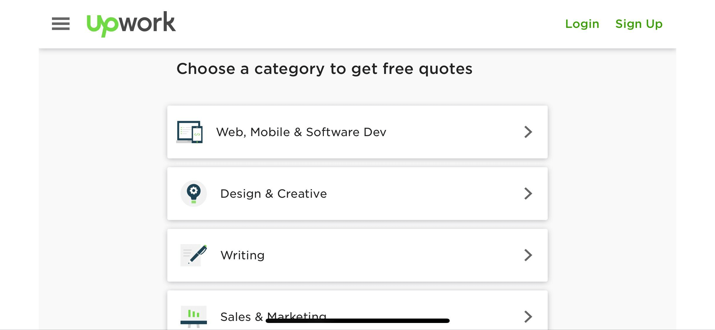
For some mobile design inspiration, look at how Upwork designed their mobile website to have big buttons with clear, sparse text. This interface is similar to their desktop website’s design and consistent with their theme, but it also makes it easy for people to click on with their thumbs – instead of a cursor.
3. Keep the Content Consistent
Although many understand that the actual layout of a website needs to be optimized for mobile, many forget that the arrangement and development of the content also needs to change. Not surprisingly, 91 percent of mobile users say that access to content is very important. Videos, scrollable articles, images, and everything else needs to be formatted correctly for mobile. People don’t want to have to click through multiple awkward pages to get to the information they need.
Focus on optimizing your content to fit small screens and scanning eyes. To do this, keep your paragraphs short and use bullet points or lists whenever you can. Leave plenty of whitespace and images to break up blocks of text, and pick a font size that’s big enough to be read on small phones.

Take a look at Refinery29’s homepage, as well as one of their articles. Everything about their mobile site screams “scrollable,” from the eye-catching images to the large headline fonts. Even the text-heavy articles are broken up with videos, headers, and plenty of photos.
When a reader looks at content on your mobile site, you want them to feel as though you designed the content specifically for that platform, even if it was originally intended for a desktop site. Incorrect formatting or content that doesn’t translate well points to an unprofessional mobile site and a business that isn’t up-to-date on the newest technology.
4. Provide Frictionless Forms
Friction on a mobile website can be described as something that causes confusion or discouragement on the part of the user. This could be anything from a form with small, un-clickable buttons to a page that won’t load quickly due to the size of its images. With every bit of friction a mobile user encounters on your site, their chances of leaving and visiting a competitor’s increases.
The core mobile UX design principles to eradicate friction lie in the search capabilities of your site. Pay attention to how users can quickly ask questions, look things up, find products, or add things to their carts. If you fail to highlight these features, consumers will bounce to another site before you have a chance to make a good impression on them.
Checking out should also be easy; Econsultancy reports that 29 percent of shoppers fail to complete a purchase because of difficulty entering information on a small screen. Make sure you aren’t falling prey to that same mistake and missing out on conversions! Double check to ensure that your checkout process is entirely frictionless from the get-go.
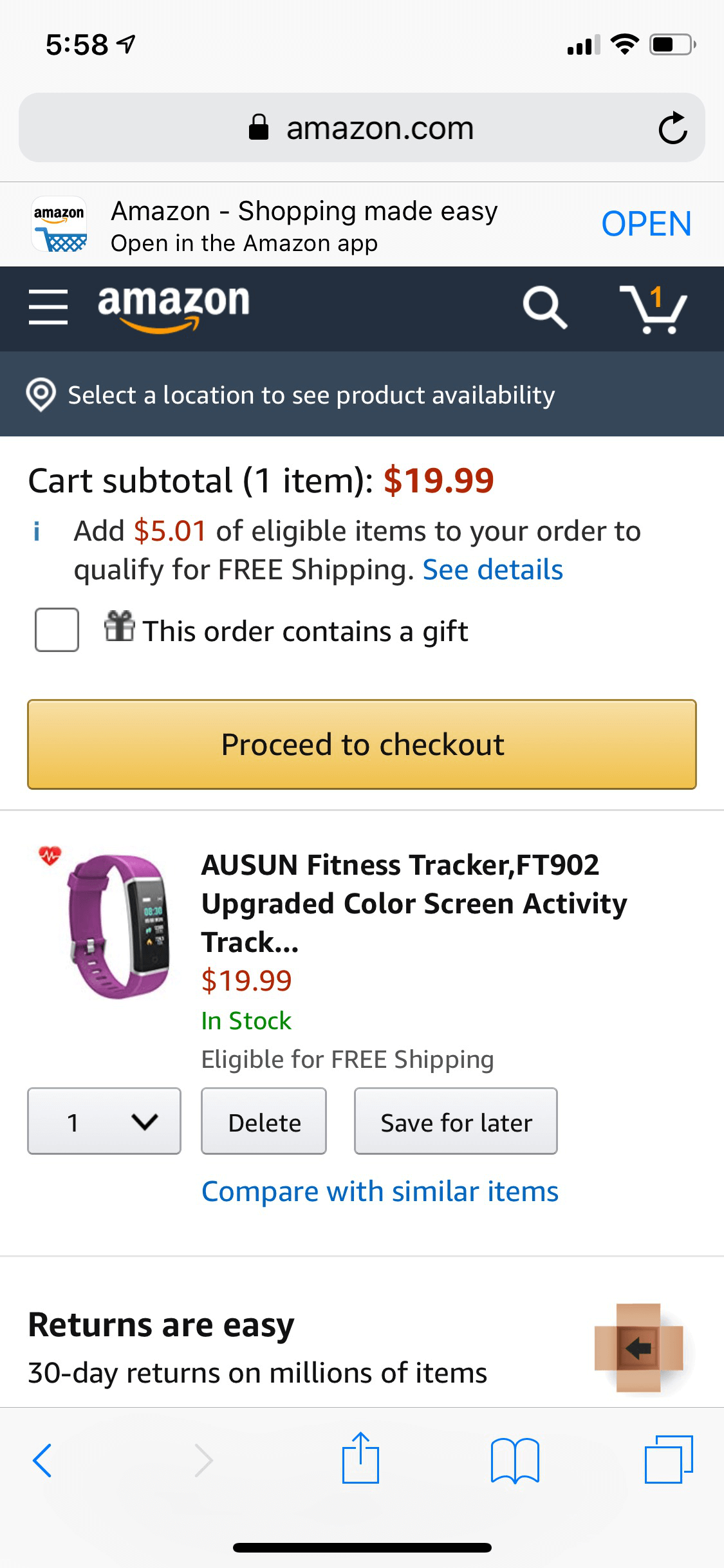
As always, Amazon provides a top-notch example of what an easy check-out process looks like. Buying on their mobile site is just as easy as shopping on their desktop platform. The cart is always visible, the buttons are easy to press, and the connection across one account is flawless. Additionally, the mobile website encourages users to check out the Amazon app, which is even more mobile-user friendly. There’s certainly little to no friction here.
5. Design for Slow Internet Connections
When most people hear that more than half of mobile websites are abandoned if they take longer than three seconds to load, they immediately focus on making their website as fast as possible. However, you can’t always control how well people’s internet is working. Therefore, you need to plan for users that have poor connections or slow-working devices.
So how exactly can you do this?
Make your mobile design extra simple so that it never takes much time to load. If you don’t want to skimp out on flashy designs and high-quality pictures, consider offering a second mobile page for users with slow internet (a stripped-down, simpler version). For instance, check out CNN’s “text only” mobile page that has no distractions or ads.

You also need to consider how external content is affecting your users. Extra plugins, ads, widgets, and apps can all lead to slow loading times. If you know you’re targeting an audience that might not have access to the best WiFi, consider removing some of the extra bells and whistles that can slow your website to a snail’s pace.
6. Optimize and Resize All Images
Graphics are one of the top factors that can detract from the appeal and loading time of your mobile website. Resize all of your images to save up to 50 percent on image bandwidth. You may even want to use smaller images that take less time to load. You can also compress images with tools on many web-hosting sites. Take a look at these featured images on ImageKit.

Can you see how much clearer the compressed and resized image looks than the original? Your users will certainly be able to, even on their small mobile devices. Plus, the website will load much faster if the images aren’t holding it back.
7. Use Mobile-Friendly Typography
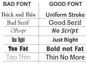
When it comes to typography on mobile devices, simple is always safe. Everything from the formatting to the actual font should be clear and straightforward. The last thing you want is for your readers to struggle to understand the content on your site.
When it comes to fonts, pick something boring. Sure, your text might not look “exciting,” but it will be readable, and that’s the most important thing. Serif fonts are usually a good bet, especially if you plan on using large chunks of text.
Keep in mind that your typography choices on a mobile site aren’t just about conveying your message through words. They can also set the mood for the site and allow for quick scanning, which is hugely beneficial considering that users have been scanning web pages instead of reading them ever since 1997.
In Conclusion
Designing for mobile users isn’t just a choice anymore – it’s a necessity. Mobile use surpassed desktop use back in 2017, with no sign of slowing down! If your company hasn’t jumped on the mobile bandwagon yet, it’s not too late!
Focus predominantly on making your mobile site easy to use. People search on their smartphones and tablets because it’s convenient, and your website needs to add to that convenience instead of detracting from it. Everything from your typography to your loading speed can contribute to your design’s simplicity, so make sure you consider every aspect.
If you have any questions or follow-ups regarding your mobile site, feel free to get in contact with us!
Jack Shepler is a Marketing and Search Engine Optimization expert. He founded Ayokay, award-winning marketing, and web design firm in Indianapolis, Indiana that has built brands, increased sales for businesses, and helped nonprofit organizations fulfill their missions since 2011. He uses his decades of experience to educate through the Ayokay blog and through public speaking. You can follow him on LinkedIn.


