

Checkout page optimization is an essential part of the customer journey. It’s the final hurdle customers must jump before completing their purchase, and if it isn’t optimized correctly, it can have a huge impact on your bottom line.
E-commerce checkout flow can be tricky to get right. Oftentimes, what consumers really want is to get from point A to point B quickly and easily. A survey by Baymard Institute found that, amongst other issues, 17% of consumers abandon their cart because of long, complicated checkout processes.
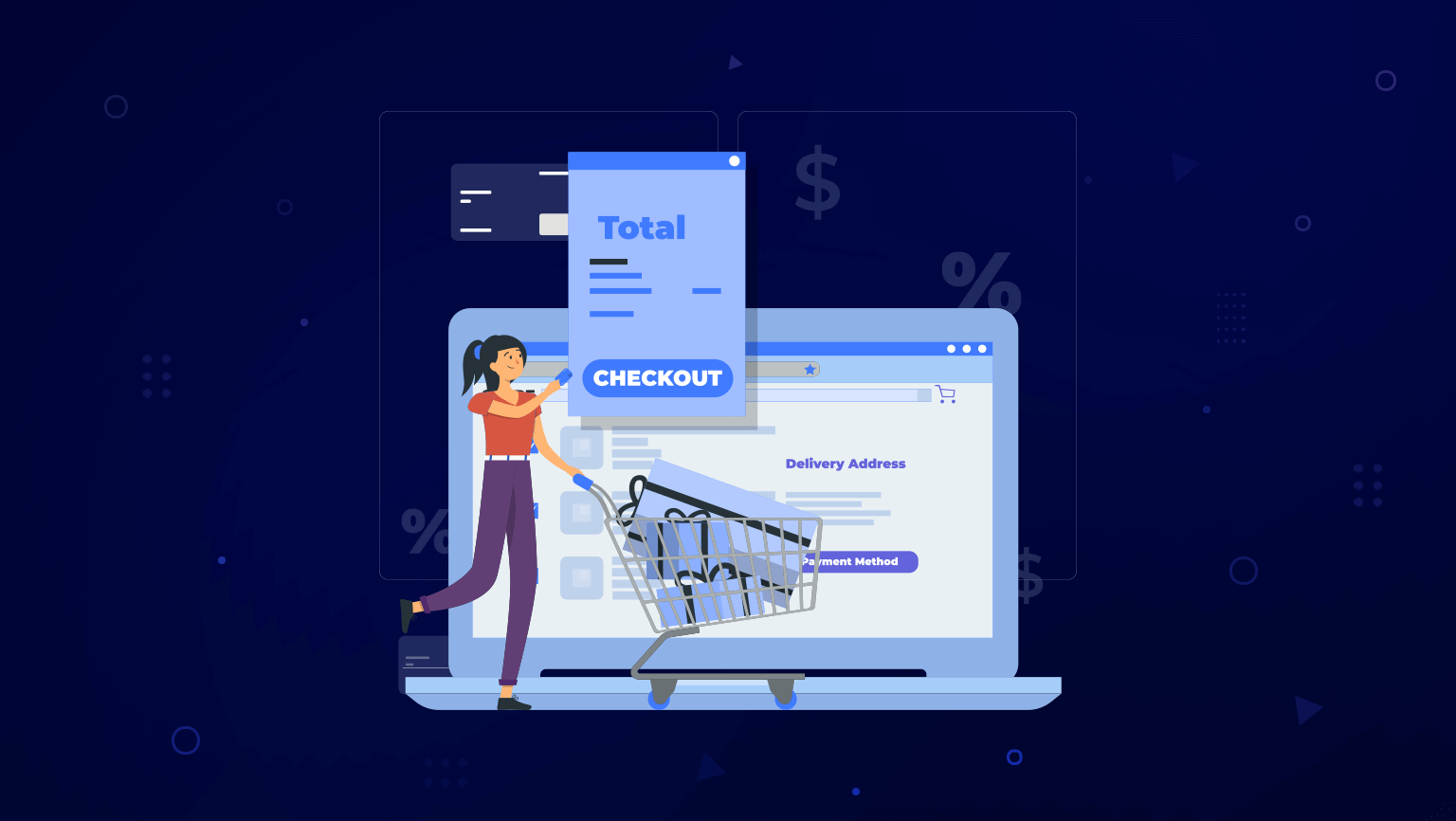
So, how do you ensure customers make it through the checkout page and complete their purchase? Here are seven techniques to optimize your checkout process.
1. Streamline the Checkout Flow
The checkout flow should be free of confusion. That means that every action the buyer takes before purchasing must be seamless and easy to follow.
To do this, start by minimizing the number of steps it takes to check out. Sometimes customers have a lot to fill out—their mailing address, billing address, card information, etc. There’s no need to add unnecessary form fields that take the customer even more time. They want to complete the checkout process as soon as possible.
Moreover, implementing progress indicators can help customers gauge where they’re at in the process and feel more motivated to finish.
Finally, always include a “checkout as guest” option. New customers may not be ready to create an account. In fact, 24% of users will give up on the checkout page altogether if there is no guest option.
2. Clear and Concise Product Information
When describing your product information, don’t be vague. Be as clear and straightforward as possible. Customers should be able to quickly understand what your product is and how it can help them – without any guesswork.
The images you use are also important. Use a background that makes your product pop and showcase what makes it special. You can also use creative staging to help the customer visualize the product.
Along with the product title, description, and image, the price should be clear and easy to find. It’s usually placed right next to the ‘add to cart’ button.
Customers will want to know their shipping options. Include the different shipping methods and give a price and estimated time for each. That way, they can choose which works best for them right away.
3. Simplified Payment Options
Gone are the days when credit cards are the go-to for online purchases. Now, there are a plethora of payment options for your e-commerce checkout process.
Mobile payments are becoming increasingly popular as they broaden the flexibility and accessibility of transactions. They also simplify the payment process, appealing to a larger, tech-savvy audience. Examples of popular mobile payment platforms to include on your checkout page are Apple Pay, Google Pay, Zelle, and PayPal.
Additionally, pay overtime platforms like Klarna, Affirm, or Afterpay are being used for large purchases. If your product is expensive, consider giving buyers the option to pay it off in installments. This leads to more conversions and satisfied customers.
Saved payments are another option that can streamline the checkout flow. It reduces friction by eliminating repetitive data entry, leading to quicker transactions. This convenience has the added bonus of boosting repeat purchases.
4. Transparent Pricing
Transparent pricing is key to building trust and credibility with your customers. It also emphasizes the value of your product, giving clear reasons why it is priced the way it is.
This encourages customers to make informed buying decisions, which in turn helps them feel more confident in their purchases. By displaying shipping costs, taxes, and other fees early on the checkout page, companies can eliminate the shock of unexpected costs—a common reason for cart abandonment.
The implementation of transparent pricing can be as simple as providing a detailed order summary before finalizing the purchase. This summary should break down the total cost into the price of the product, shipping charges, taxes, and any other additional fees.
5. Clear Call-to-Action Buttons
Call-to-actions are one of the most important pieces of the checkout process (and the sales funnel in general). They direct the customer through the purchasing journey and guide them to the next step.
Prominent and descriptive buttons communicate the action you want the customer to take, whether it’s “Add to Cart,” “Proceed to Check out,” or “Finalize Purchase.” Be as clear as you can, avoiding ambiguous or confusing labels. Remember that clarity should always be a priority.
Implementing visual cues such as arrows, highlighting, or color contrasts can further enhance their effectiveness. These cues draw attention to the next steps in the process, guiding the customer intuitively toward the intended action.
6. Minimizing Distractions and Friction
Your checkout page should take customers from “I want that!” to “I bought that!” The road to purchase should be free of detours that can veer customers off course.
Unnecessary elements impede the checkout flow, distracting customers from the end goal. Be sure to only include the essentials and remove anything that doesn’t contribute directly to the transaction. For example, external links and additional navigation options can divert your customers to explore elsewhere.
Forcing account creation can also frustrate customers and cause them to click off. Instead, offer a ‘guest checkout’ option or a simple ‘save details for next time’ feature post-purchase. Keep the path clear, smooth, and frictionless.
7. Testing and Analyzing Checkout Performance
Want to optimize your checkout process for maximum efficiency? The best way to do this is to analyze user behavior to find out what is working for your business and what isn’t.
To start, A/B testing the checkout process allows you to experiment with various design elements, such as button placements, color schemes, or call-to-actions. By comparing different versions, you can easily determine which configuration leads to higher conversion rates.
Additionally, consider analyzing user behavior and drop-off points. By understanding where customers abandon their journey during the checkout process, you can address issues such as confusing interfaces or obstacles that lead to customer frustration. This enables you to optimize those areas and ensure a smoother experience for future customers.
Conclusion
Abandoned carts are inevitable, but that doesn’t mean there aren’t ways you can improve your conversion rates. By creating a frictionless checkout process for potential customers, you will see guaranteed improvements in your bottom line.
Want to learn more about how to maximize your e-commerce checkout flow? Ayokay is here to help you and your business, with a thorough and customized approach.
Learn more about how Ayokay will take your website to the next level.
Jack Shepler is a Marketing and Search Engine Optimization expert. He founded Ayokay, award-winning marketing, and web design firm in Indianapolis, Indiana that has built brands, increased sales for businesses, and helped nonprofit organizations fulfill their missions since 2011. He uses his decades of experience to educate through the Ayokay blog and through public speaking. You can follow him on LinkedIn.